
Emirates Airlines Connect.
Redefining the experience design of Emirates Airline’s customer service backbone- Reservation and Departure Control System
My role
I led the experience design efforts of Emirates’ new Reservation System and Departure Control System- (collectively called PSS or Passenger Service Systems in airline lingo) from April 2015 to July 2017.
User advocacy- Undertook hours of diary-studies in airport counters and call centre to get in the shoes of users, and thereafter been their representative in all forums.
Ideation- Partnered with Product Owners during insights finding, ran workshop with users to re-align business goals with user’s.
Design Vision- Defined the experience design direction to pave way for alignment in and across products. Defined and evangelized user goals.
Coordination-Collaborated with six other designers and partner Business Analysts across multiple projects.
Design Execution & Validation- Defined journeys, wireframes, prototypes and led the design specs efforts, ran guerrilla and lab usability tests and fed them back in the product.
Engagement with Leadership- Throughout the project lifecycle, presented design work to executives, senior stakeholders and other project teams, sometime for getting buy-in and sometimes as demo.
Background
Unlike other airlines, Emirates runs its in-house PSS, which over years had become a cluttered accumulation of features-
Difficult to learn, use and scale. A large transformation project (Codename EmPact) was devised to rebuild the PSS.
The key business goals were to reduce training and transaction times, while the experience goals were to make each staff-customer interaction less transactional, aligning to the Emirates’ aspiration of being a “lifestyle” brand.

This Customer Journey Map (work of Engine Service Design, UK) reveals the plateaus during current reservation and departure stages, and the potential delta in the future.
Challenge
Mediating the business and experience goal in an intense environment with fixed release date and aggressive scope was the biggest challenge.
The experience goals themselves were quite challenging. In conventional UIs, the interaction is between an UI and a human. While in this case, the UI is a “facilitator” of interaction between two human (staff and customer). At the same time, the UI is also an “inhibitor” of interaction between the two. Two experiences had to be designed- The interaction between the UI and the user (staff) and the interaction between staff and customer.
Approach
Principles and Direction- The Customer Experience Design Principles (work of Engine Service Design, UK) helped us steer through the thicks of the project and make decisions where there wasn’t much scope of getting data. Crunching the existing research work and the design principles culminated into clear actionable directions.

Customer Experience Design Principles

Design Directions
Metaphor- The idea of seeing the UI as an “assistant or helper” evolved during the initial design discussions. An assistant that would help make the interactions with the customer more “experiential than transactional”. E.g. Whenever a Contact Centre Agent takes a call from a customer, the Reservation System UI, like an efficient assistant, lays out every necessary for the agent to swiftly serve the customer while being able to have a meaningful conversation.

While an agent is taking in a request for a new flight reservation, the Reservation System UI throws some destination specific information e.g. weather, prompting a possible conversation which is more than just the transaction.
Framework & Methodology
Two separate teams built the Reservation System and the Departure Control System (later re-branded as Res Connect and Airports Service Connect respectively). I did the up-stream design work for both the teams.
Though two separate information architectures were built for Res Connect and Airport Services Connect, the idea was to keep them similar from structural and navigational perspective. Also, the user demographics, behaviors and work motivation were close.

(Part of) Information Architecture of Res Connect

Information Architecture of Airport Services Connect

A primary Contact Centre Persona

A secondary Airport Persona
I lead the feature design work, often co-creating with Product Owners, Business Analyst and actual users (Frontline staff i.e. Contact Centre and Airport Agents). The designers in the two product teams would execute the design details before Software Engineering begins implementation. Concurrently, I would work on upcoming feature designs and also test out the already built features. Managing the test outcomes and feedback was a subsequent challenge.
UI component framework- Because of the fixed release date, immense scope and disparately small size of the design team, we opted to use AngularJS Material UI component framework. Also, the initial plan was to build the systems for both touch and mouse driven hardwares (which was dropped later owing to cost constraints). Hence, the choice of AngularJS Material as the UI component framework since it is optimized for both touch and mouse usage.
The already defined visual and interaction guidelines enabled the design team to give more focus on problem solving than on crafting the UI. The existing guidelines also served well as a bridge between the designers and the UI developers. As designers, we also leveraged on the end user’s familiarity with Material Design UIs.
On the flip side, we often found the framework limiting our design choices. In many instances, we would go beyond the defined principles to make our own components. It was satisfying to witness the framework release the same component which we had defined in the past (eg. Expansion Panels).
Design Execution
I have intentionally omitted the design details of product features here.
I have attempted to briefly show the "how" and not the "what".

Booking task flow in Res Connect

Check In task flow in Airport Services Connect

Low fidelity UI sketches

Low fidelity UI sketches

Low fidelity UI sketches

Visual Design guidelines for Airport Services Connect

Design drafts for Res Connect

Design drafts for Res Connect

Prototype for Airport Services Connect
Validation & Feedback
Many a times we found ourselves debating endlessly on design decisions and unable to move forward. In times like this, we often resorted to our user’s to determine the right direction. Apart from the numerous guerrilla tests, we conducted series of usability tests in the later part of 2016 in Dubai, Mumbai and Manchester. The aim was to quantify the overall usability, compare it with the predecessor, track usability changes across time. We also got loads of insights which challenged our convictions.

Part of the Test Script designed for testing the usability of Res Connect

Screenshot of Morae Manager used to analyze the test sessions. This one is from a usability test session of Res Connect in Dubai contact centre, conducted when the product was about two-thirds ready

Part of a report showing the comparative scores from SUS survey of Res Connect across contact centres

Testing out Res Connect with a contact centre agent in Manchester, UK
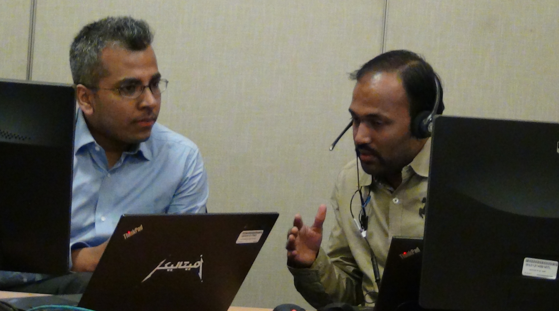
Testing out Res Connect with a contact centre agent in Mumbai, India

Responses and scores from System Usability Scale (SUS) surveys
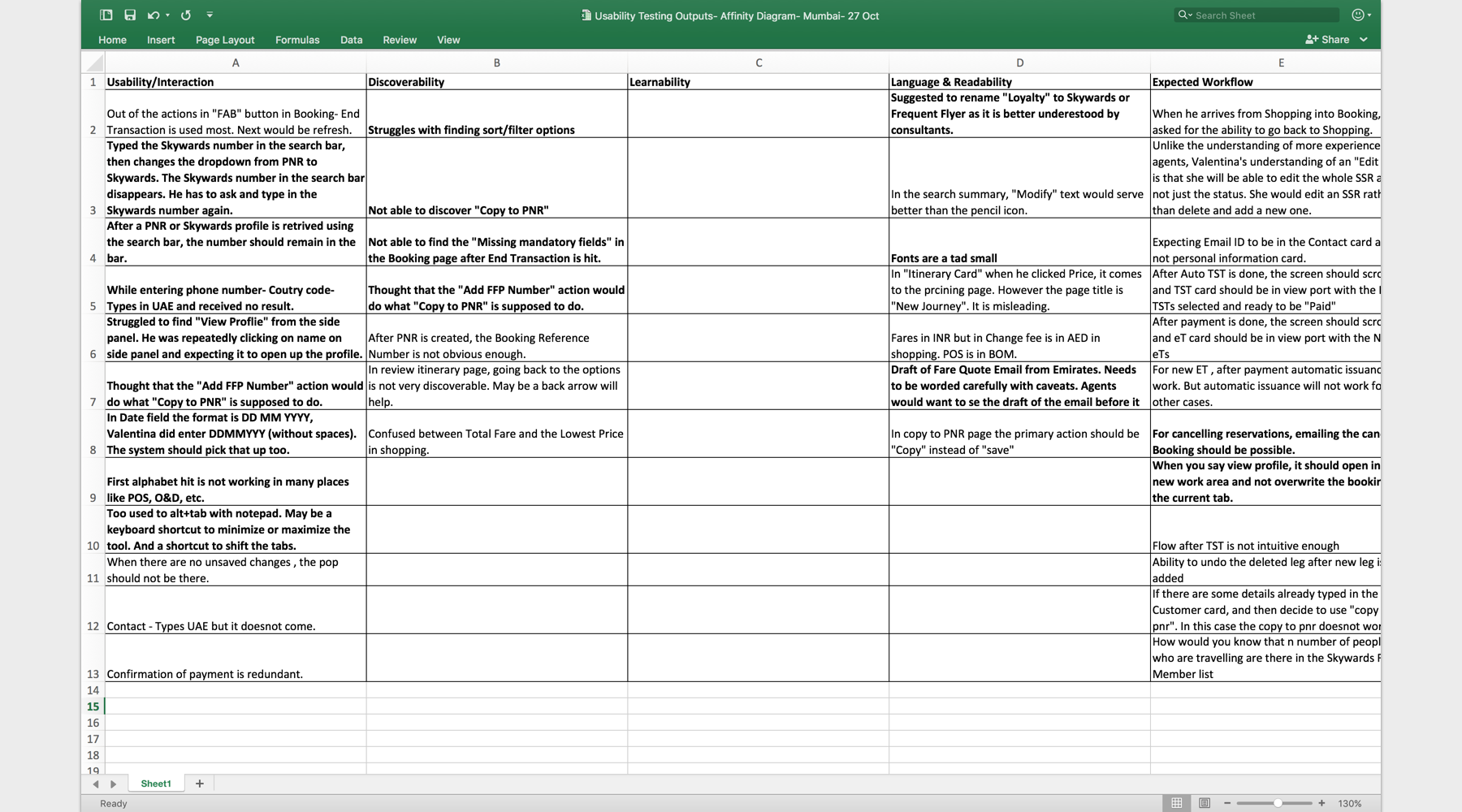
Affinity Diagram of the feedback received during test sessions
Managing feedback has been one of the biggest challenges for me in this project. Deciding on what feedback goes back into the application took disproportionate amount of effort and time with Product Owner and Software Engineering.
Release
The release cycles of the two products had different timelines and cadence- While Res Connect’s releases were meatier and less frequent, the releases for Airport Services Connect were light-weight and more frequent. Each release, at one hand took some pressure off the team, the subsequent diary studies added to our list of identified gaps in the product. However cliched it may sound, releases actually were just the beginning.
I also worked with the Change Management Team helping them establishing in the business and later with the release campaign.

Images from Training, Roadshow, Release events and of live usage from Dubai Contact Centre and Dubai Airport.

Explaining Change Management

Pre-launch posters for Res Connect
Impact
Some of the metrics like the training time, which got measured even before release, gave the team a lot of impetus. Res Connect’s predecessor required 5 full-day training course before one could get started on it. Contact centre staffs, who had worked on Res Connect’s predecessor, could get started on Res Connect after just one hour share-out session and a day’s of familiarizing-by-self session. New users’ training time was about two-thirds of the training time on the previous system, both for Res Connect in contact centers and Airport Services connect in airport.
Even though, our users were aware of the numerous gaps with which we went live, the acceptance was tremendous. The fact that the systems were built keeping them and their motivations at the centre, made it click.
The design team was at the cusp of all the action during this program. We realized that even though we were enhancing the experience of (our staff and) our customers at contact centre and in the airport kiosks, there were gaps in the customer journey in between the touch-points. The design team worked towards bridging the existing gaps in experience, in another project in parallel.
Res Connect and Airport Services Connect was built for agents with scalability in mind. Another two projects were initiated to build on these two products to make systems for contact centre and airport managers.
Design Team
Ariel Steinberg (Researcher), Chayan Deb (Design Lead), Daniel Al Shirky (Designer), Manprit Kalsi (Designer), Maria Pontanares (Designer), Mohammed Shaheer (Designer), Taz Hussain (Design Lead), Vandhana Bhaskaran (Design Manager)